A new Light Table experience
With our release of the 0.2.0 version of Light Table we laid the foundation we needed to continue moving forward. In this release we wanted to focus on making that foundation a joy to use by taking the time to really craft an experience. To that end, even though 0.3.0 is still an alpha, it will feel much better to anyone who used the previous version and many of the things that seemed manual in the previous incarnations will “just work” now.
Let’s take a peek at what’s new or go download it!
A gorgeous new look
The last version of Light Table was somewhere between cool looking and a retro throwback, which didn’t get anywhere close to the cohesive experience we wanted. The new look is all about drawing you into something that “feels right” and just looks beautiful. We spend a lot of our time in these environments, they should be easy to parse and pleasing to look at. I’m really happy with where we landed on this.
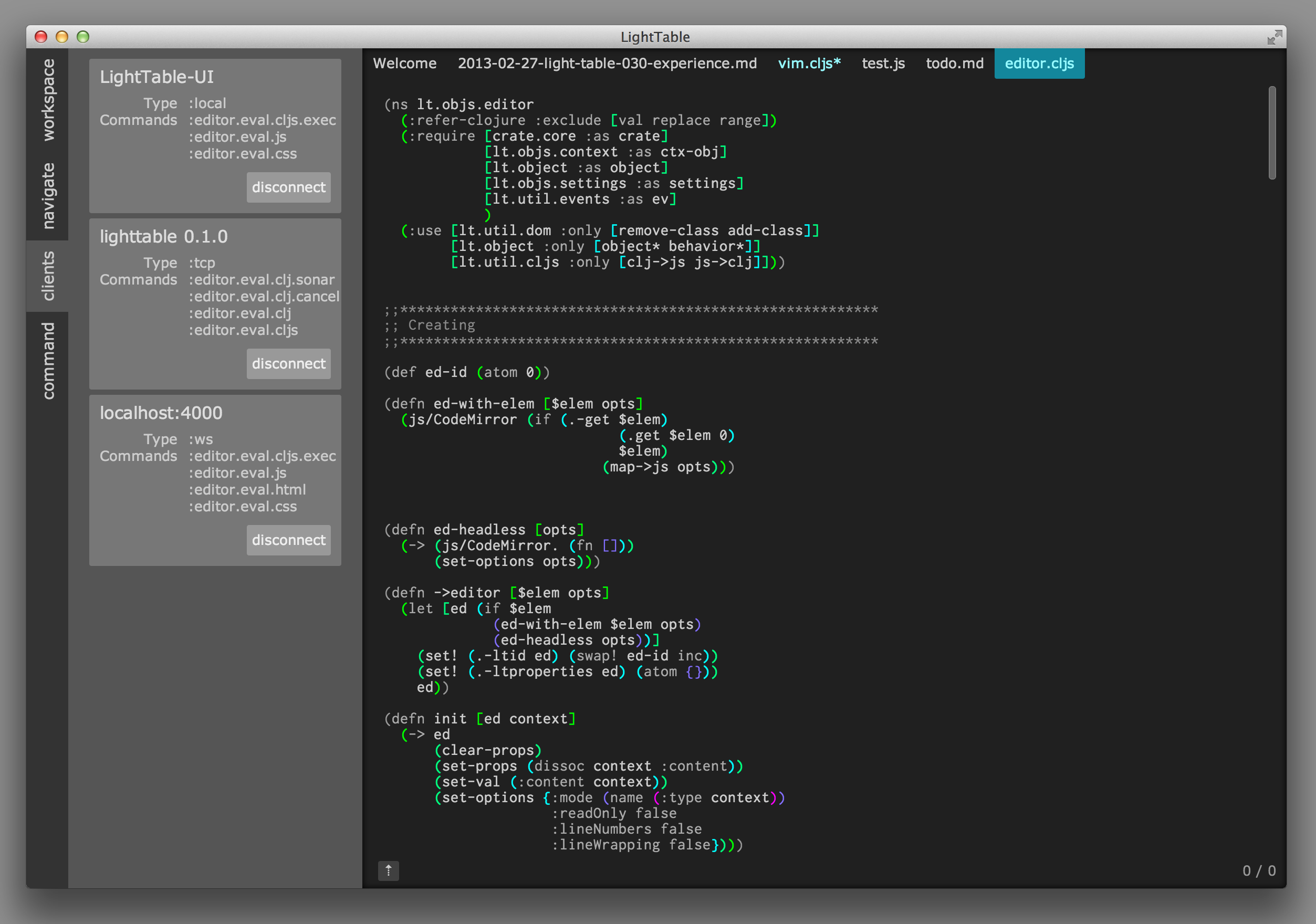
You’ll notice some simple quick animations and a number of visual affordances that make the app feel a lot more polished than it was before. And if your preference is for something else, you have complete freedom when writing your own skin.
An inline results experience
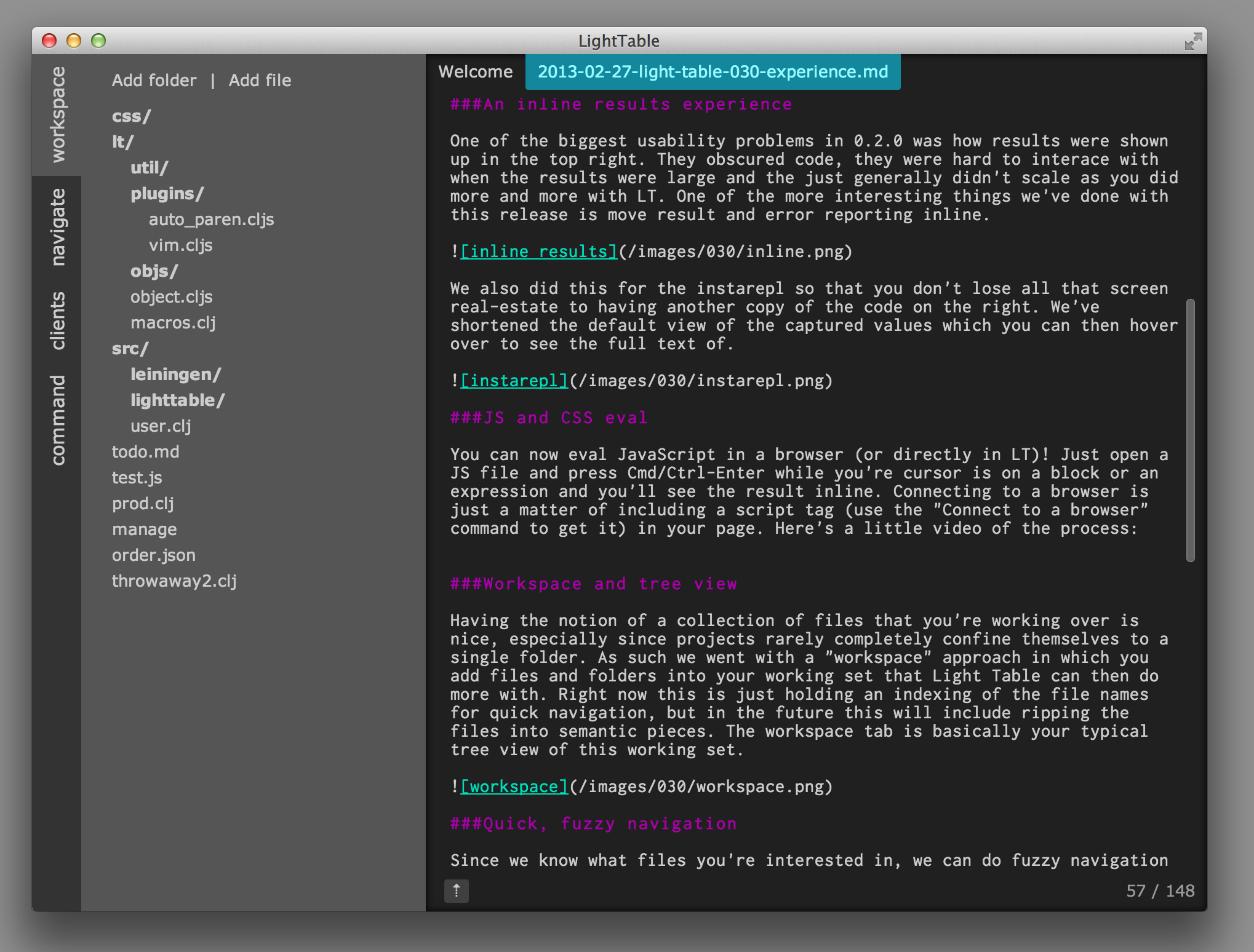
One of the biggest usability problems in 0.2.0 was how results were shown up in the top right. They obscured code, they were hard to interact with when the results were large and the they just generally didn’t scale as you did more and more with LT. One of the more interesting things we’ve done with this release is move result and error reporting inline.
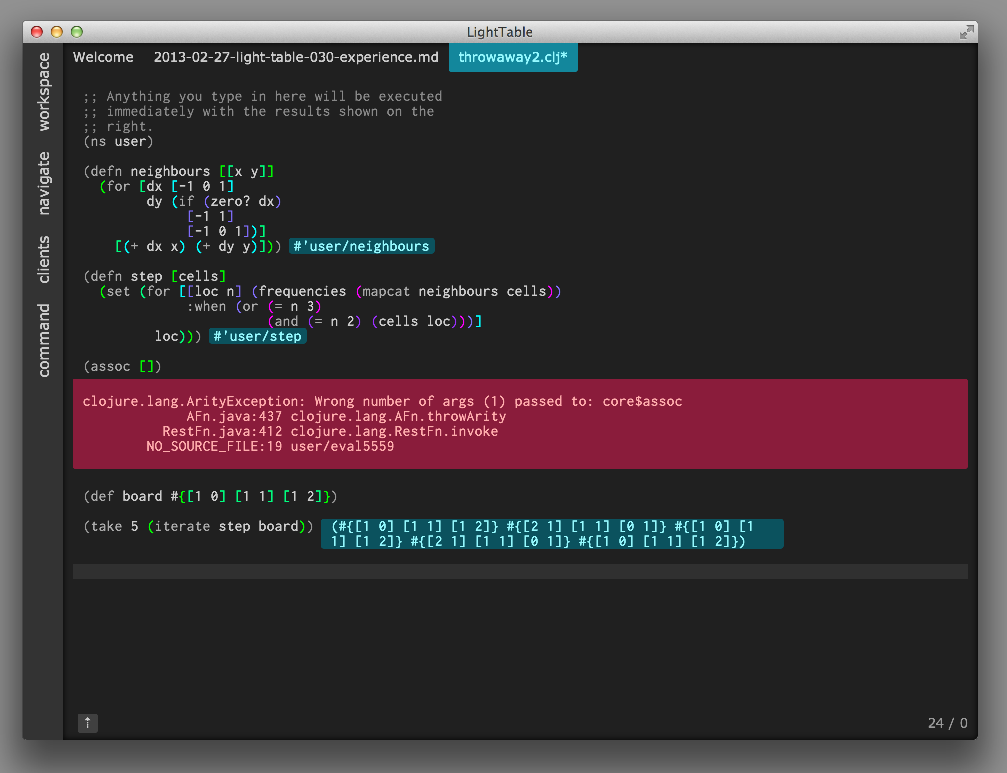
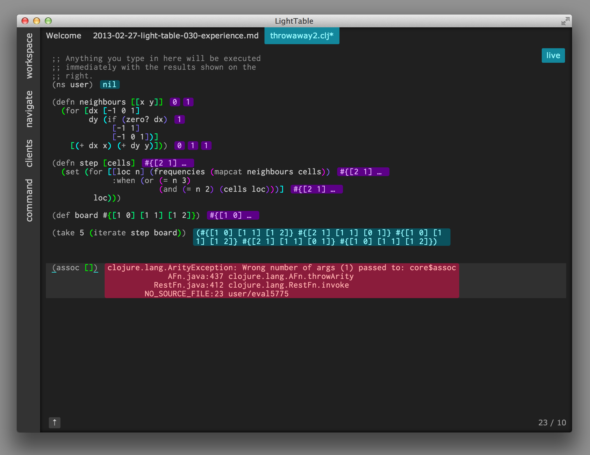
We also did this for the instarepl so that you don’t lose all that screen real estate to another copy of the code on the right. We’ve shortened the default view of the captured values which you can then hover over to see the full text.
JS and CSS eval
You can now eval JavaScript in a browser (or directly in LT)! Just open a JS file and press Cmd/Ctrl-Enter while your cursor is on a block or an expression and you’ll see the result inline. Connecting to a browser is just a matter of including a script tag (use the “Connect to a browser” command to get it) in your page. Here’s a little video of the process:
You can also “eval” css into the browser, allowing you write and test your CSS without having to refresh. The same things works with ClojureScript too, though you need to have some things already on the page for it to work. Some tutorial content for that is forthcoming.
Workspace and tree view
Having the notion of a collection of files that you’re working over is nice, especially since projects rarely confine themselves entirely to a single folder. As such, we went with a “workspace” approach in which you add files and folders into your working set that Light Table can then do more with. Right now this is just holding an index of the file names for quick navigation, but in the future this will include ripping the files into semantic pieces. The workspace tab is basically your typical tree view of this working set.
Quick, fuzzy navigation
Since we know what files you’re interested in, we can do fuzzy navigation as popularized by Textmate and carried on in SublimeText. It’s the fastest experience we’ve seen for a strict-file recognition approach and so we went with it too.
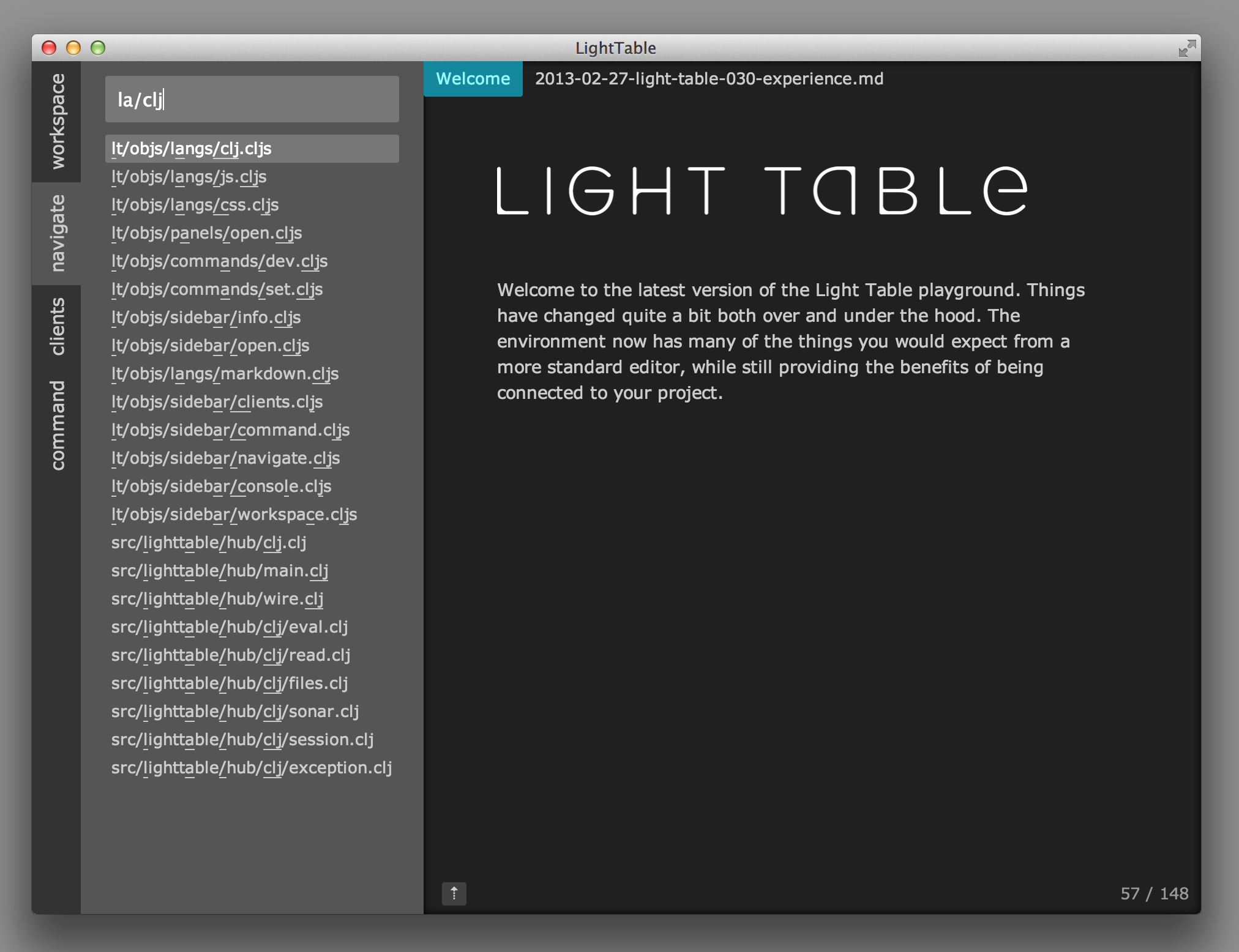
In the long run, there will be more efficient means of getting around to the exact things you want, but for now this has proved to be a great placeholder as we start to work on more of the language-focused stuff. We use the fuzzy search everywhere there is a filterable/searchable list and we intend to keep that up; it’s far more efficient than simple substring matching.
Command search
A big thing I wanted to tackle was to come up with a command strategy that works nicely with the keyboard, but also allows for some complex and interesting interactions that remain workable with a mouse. The side command search is what we came up with.
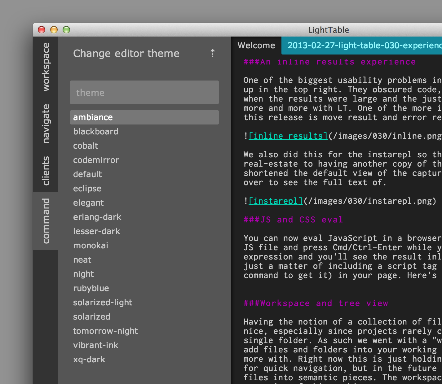
You can quite literally do everything from the command search, from changing the skin of Light Table to toggling Vim mode and starting an instarepl. We want a single canonical way for people to be able to answer “How do I…” - you go to the command search and type a bit of what you’re looking for.
Vim mode and custom key binding
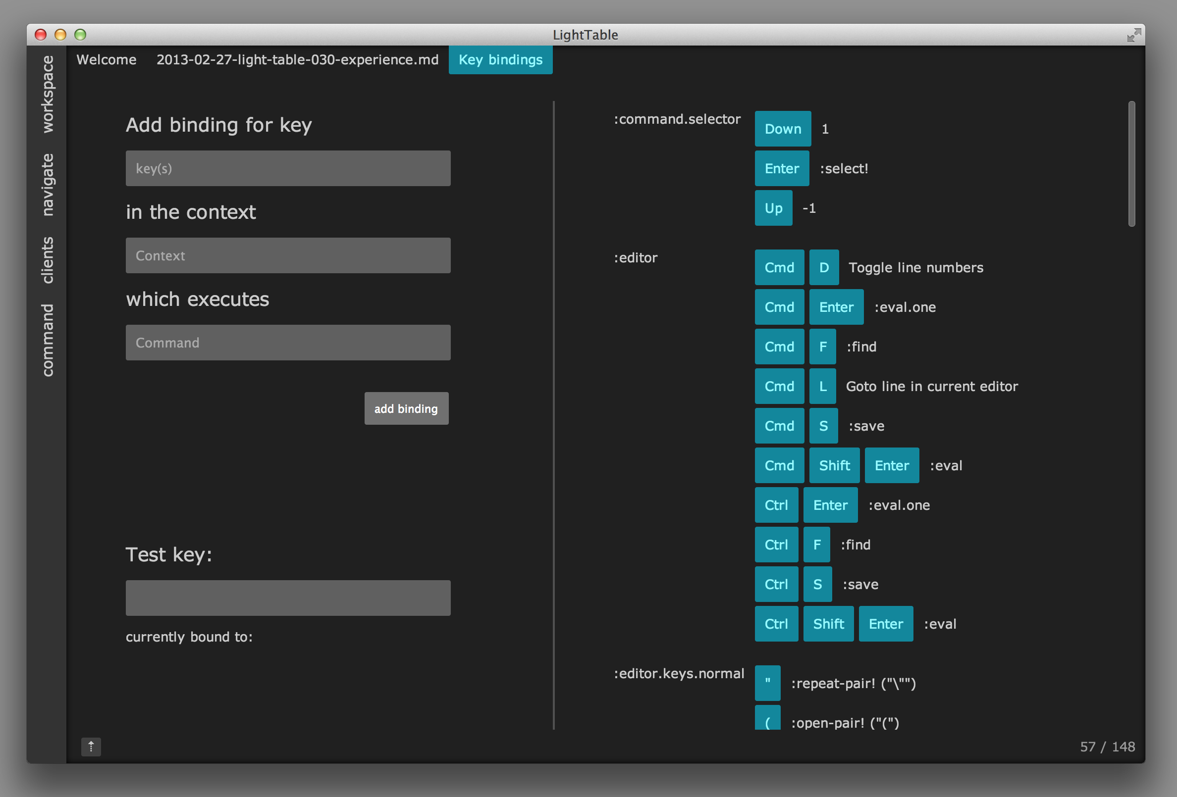
As I’ve stated a few times, I’ve been a Vim user for over a decade and I’m happy to say that Light Table now has a halfway decent Vim mode. It’s still rough around the edges, but it takes a nice step forward. The best part is that it’s just an integration of the excellent work that has been done for CodeMirror’s Vim keybindings, so if you want to make them better, take a look at the work there. Along with the vim keybindings is a little keybinding interface that you can use to bind any key combination in any context to a command. Right now this doesn’t include many textual commands, but they’ll be coming in the near future.
It “just works”
We cleaned up a ton of the little things that started driving us nuts, everything from being able to reorder tabs to making the instarepl more reliable. We wanted to get rid of as many of the papercuts as we could hunt down and our hope is that you’ll find that Light Table just does the right thing when it can. A great example of this is that you’ll never be asked to select a path to connect to a project - it just figures it out.

Toward 0.4.0
With 0.3.0 we now have a base editing experience that we’re happy with and we’re going to start heading into the semantic parts of the LT experience, while also working on really fleshing out the plugin system - the latter of which will be the beginning of our early beta work. As such, we’ll be getting our Kickstarter backers more involved soon to help us figure out exactly what our plugin story will look like. There’s lots of very exciting stuff to come!